Wispr Rebrand — Designing the future of voice

At Wispr, we’re building the future of voice—interfaces that help people move through their thoughts with ease, precision, and expression. But while our product was evolving rapidly, our brand wasn’t keeping pace.
We were missing the spice...

The existing brand system was built with utility in mind, but utility alone couldn’t carry the weight of a company pushing boundaries in human-computer interaction. With one typeface, one tone, and no unifying concept, our system lacked emotional depth, creative flexibility, and visual distinction. Our palette worked well in product, but fell short in the wild. It wasn’t recognizable in a feed, and it wasn’t memorable in a moment. We knew it was time to make the brand feel as seamless, expressive, and forward-thinking as the experience itself.
We weren’t just looking for an aesthetic upgrade. We needed a system that could scale. One that would work across every touchpoint: product, web, email, social, print (maybe). A system that could meet our users in their rhythm and move with them.
Finding inspo beyond tech
While Wispr is very much a product of San Francisco, our marketing team lives around the globe. We were intentional about not simply reflecting the forces inside our own echo chamber, but meeting our users where they are in their lives.
We respect our peers but noticed something akin to “coffee shop syndrome.” Why have all $8 latte shops started to look the same?
This meant breaking out of the norms for “another innovative tech startup,” and diving into the brands and industries that inspire appreciation far beyond: lifestyle magazines, street posters, artistic and creative brands that shape consumer taste. While we wanted to benefit from existing mental models and visual conventions, we also wanted to evolve beyond the status quo:
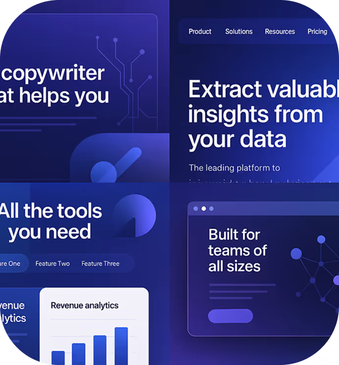
Cool palette: Icy blues and purples, sometimes with gradient overlays that suggest precision, technology, and the future.
Dense layouts: UI hero sections with multi-tab navigation, small sans-serif type, chart previews, overlays, and widgets.
Geometric motifs: Abstract shapes, circuit-like grids, stylized illustrations.
Typographic framing: Compact, bold sans-serif headers (often uppercase), tight leading, and functional subheads.
Imagery: Glossy 3D-style visuals, UI browser mockups, node graphs on dark or code-blurred backgrounds.

The default conveys competence, but feels cold. We wanted to feel grounded and human.

Minimalist, but not for the sake of it. We loved the idea of being “purposefully editorial,” where every space served emotional or cognitive clarity.
Many AI brands say, “Look how advanced we are.” We wanted to say, “We’re advanced, but for you—messy sometimes, calm and polished other times, intelligent, diverse, creative.”
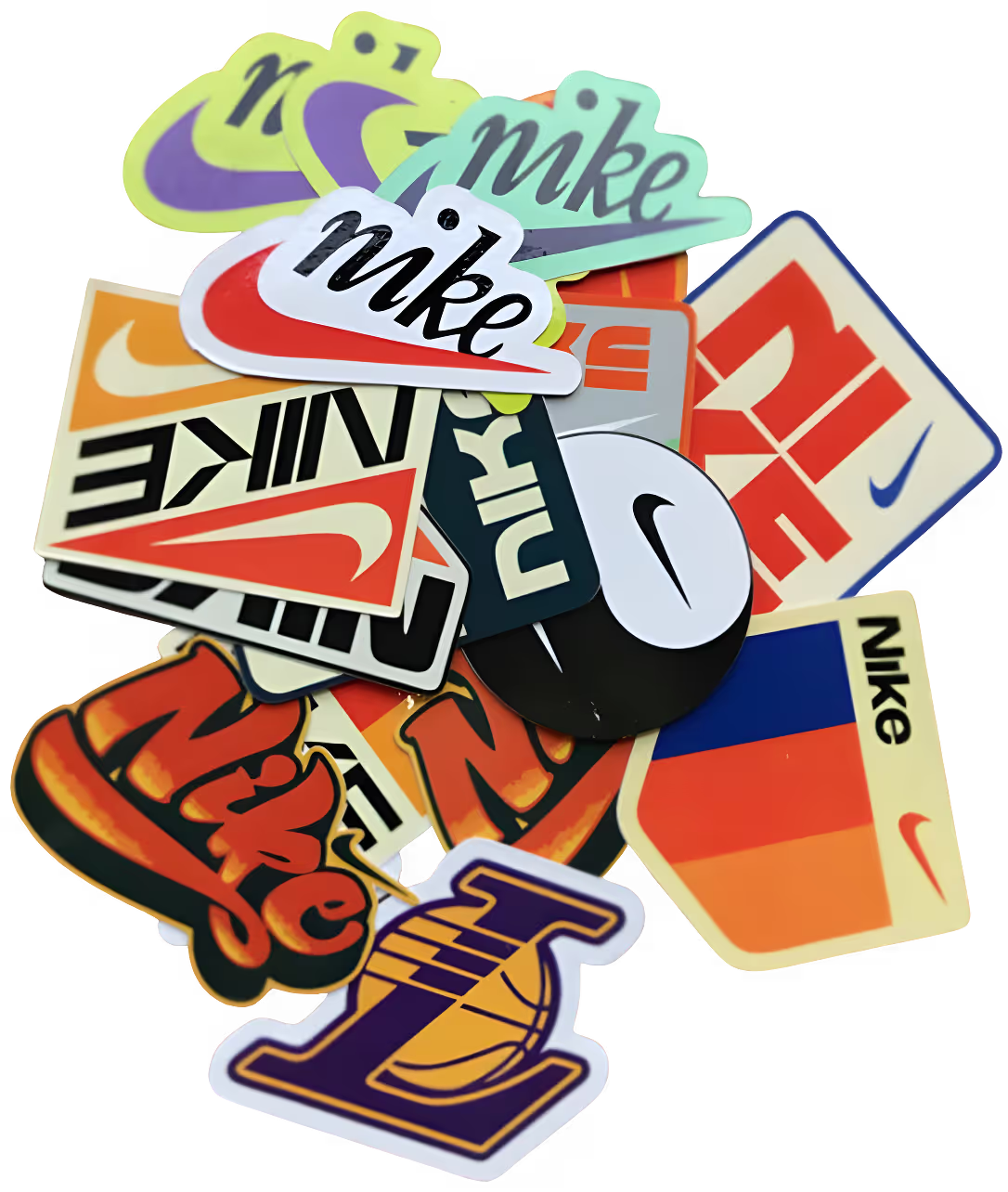
One example of this inspiration was our fascination with vintage Nike stickers and the warm energy of discovery-based apps like AllTrails.
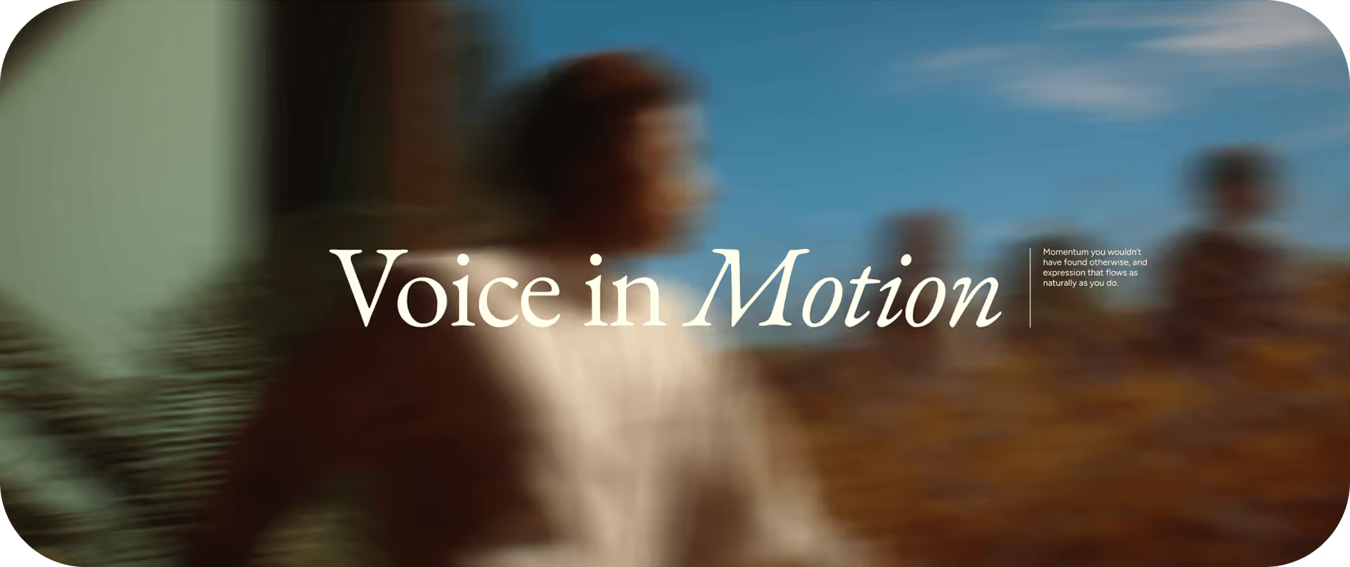
The “big idea”—Voice in Motion
Every brand identity needs to be anchored in a big idea. As we explored territories for our next chapter, we weren’t searching for a concept. We were looking for a truth. Something flexible enough to guide design decisions, and evocative enough to spark feeling.
We landed on Voice in Motion.
It captures the essence of what Wispr makes possible: fluid, intuitive expression. It also speaks to the transformation that happens when voice becomes thought and thought becomes action. The concept draws from philosophy, poetry, the flow state, and river metaphors. Voice in Motion helped us unlock not just how we speak, but how we look, move, and feel. It became the connective tissue between our product, our people, and our purpose.
Heads down: designing the system
With our concept in place, we built a system rooted in rhythm, presence, and clarity.
We introduced a new, emotionally resonant palette—anchored in tones like Lumen and Pulse—to bring warmth, optimism, and contrast to every touchpoint. Designed for storytelling as much as UI, our updated colors scale effortlessly across web, print, and motion. They remain accessible, but now feel unmistakably Flow: restrained, but bold when needed.
Our use of soft neutrals and thoughtful contrast leans away from the clinical palettes common in AI startups. Inspired more by quiet luxury and editorial design than by dashboards, our color strategy includes subtle green accents (used in CTAs and UI details) that feel rooted in calm vitality, not urgency.
This signal is never overwhelming, but unmistakably Wispr.


We introduced typographic contrast to match our voice. Figtree brings clean modernism, while an editorial serif adds warmth and personality. The pairing gives us room to flex: clarity in product, expressiveness in brand.
The system is utilitarian but airy. Humanistic quirks, especially in numerals and punctuation, give our words a lived-in quality. There’s confidence in restraint (and a touch of nostalgia).
We worked with an illustrator extraordinaire, Olivia, to bring Voice in Motion to life through illustration.
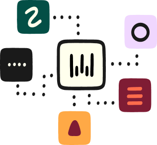
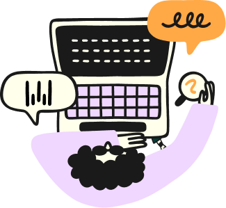
Fluid, organic forms feel intentional and human. They capture people mid-thought, mid-gesture—in flow. playful proportions reflect the cadence of voice and the spontaneity of ideas forming out loud.
The result is a system that feels more like a sketchbook: dynamic, conversational, and alive.

Wispr avoids the flat minimalism common in SaaS brands. We use gentle curves, generous spacing, and soft corners to evoke clarity and warmth. Yes, we know hard corners will come back. But for now, soft suits us.
Subtle microinteractions and slow fades create emotional pacing. On web, we use wide margins, generous whitespace, and clear hierarchy. Spacious two-column layouts give the work room to breathe. It’s less SaaS dashboard, more editorial Sunday.
We wanted to communicate motion and progress, but also acknowledge that many users are stationary—deep in focused work. The result is a quiet confidence. Brand through rhythm, not noise.
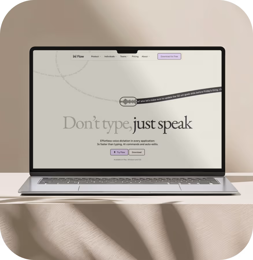
Most productivity tools rely on browser screenshots or static UI grids. We wanted to feel more real and approachable. Flow is often shown in tactile, real-life spaces—places we actually live and work.
These cues echo higher-end editorial brands, not DTC cliché. Product visuals are minimalist, styled, and calm. Icons and screenshots hint at presence. They don’t shout for attention. The result: lived-in, aspirational, but approachable.
.webp)
.webp)
.webp)
.webp)

One of our biggest challenges was bridging product and brand. We didn’t want two worlds. We wanted contrast (based on context) with cohesion: editorial layouts beside clean UI, grayscale meeting warmth, utility matched by rhythm. An additional challenge was to showcase our evolution without having a “destination” app—Flow lives inside the apps people use every day.
We’re not finished. As Flow evolves, so will this balance between embedded simplicity in UI and expressive identity in the wild.
But would it work?
Brand books are beautiful—but useless until road-tested.
With Flow for iPhone launching, we made a bold/stupid decision: launch with entirely new creative across all channels, and redesign the entire website in two weeks. The hardest part of the website? Conveying the power of Flow in seconds. This is where motion design became core. From scroll behaviors to hover states to the all-important (all-consuming) hero header animation.
We went live the day before launch. Nothing broke. And launch videos carried that tone forward—visually and emotionally—to millions of people.
We think we’ve landed in that beautiful in-between: somewhere between editorial lifestyle and streamlined UX maturity. A brand between machine and muse.
The day after launch, I messaged a few people I really respect. Most replies were thoughtful and kind. But one stood out: “New site looks slick. Very hard to nail that ‘cool yet professional’ tone.”

The
Voice Interface
Company.
Less of a flow, more of a rapid
This rebrand and new website were completed in six weeks—from concept to rollout—by our in-house team of 2.5ish, led our brand new Marketing Design Lead Kim, with a few amazing freelancers along the way. It was fast, focused, and collaborative in the pieces that made sense.
Now, every visual, every blur, every curve or cue echoes the same idea: voice, in motion. From paid ads to onboarding UI, Flow became something new—but also something familiar.
So what now?
Brand never sleeps. Every new platform or surface brings a new gray (or Dawn) space to evolve into. We’re midway through a sonic brand exploration to make sure our identity lives not just in the visual, but in the full sensory experience. We’re also exploring an update to the brand mark itself.
And if you’ve opened pretty much any design app this year, you know the city never sleeps either. Whether it’s Midjourney, Canva, Envato, or the LLMs—potential evolves daily. So, then, do the ways we express ourselves.
The best part? We get to do it again and again...
Project Credits (aka legends)

Flow with
your voice
Voice dictation built for people who like to move.
Free for 14 days.